
OH! BROTHERS BRANDING
GOAL | BRANDING DESIGN FOR SMALL BUSINESS

YEAR
2010
DISCIPLINES
Graphic Designer
PROJECT TYPE
Work
APPS
Adobe Creative Cloud
ROLE
Graphic Designer
CONTRIBUTION
Visual Identity
01. DESCRIPTION
Oh! Brothers is a small business that sells Canadian Arts & Crafts in Vancouver BC. For more than 30 years, it was located in Kerrisdale, and in 2010, it was moved to Kitsilano. For the new location, a new visual identity was needed.
It is a destination store with a variety of fun and functional arts and crafts made by Canadian Artists or produced in Canada. You can find gorgeous handmade wooden bowls, unique jewelry pieces, functional lovely pottery, and much more.
![]()
02. BRAINSTORMING
Background
Oh! Brothers is an established store located in Kerrisdale, Vancouver, BC. The owners decide to move the store to a new location in Kitsilano. For the move, they decide to renovate the visual identity, to better suit the new location, that has a younger, more eclectic population.
User Story
A customer visiting the new Oh! Brothers location in Kitsilano, wants to buy a gift to take to her family abroad. It's important for her to find a Canadian handmade piece. She also wants to get information on the artist, and some instructions on how to take care of the piece.

![]()
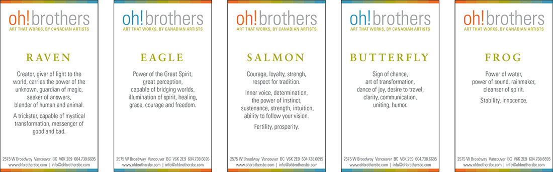
03. VISUAL IDENTITY
The name "Oh! Brothers" invites to a more playful design. The goal of the branding redesign was to create a more lively, colourful, modern identity.
I decided to work using a combination of 3 main colours: orange, green and teal.
In the logo, the 3 main colours alternate in the word "Oh! and the tagline, to highlight them. The word "brothers" goes in a neutral colour. To loosen it even more, no caps are used in the logo, only on the tagline.
![]()
04. BRAND APPLICATION

![]()
Check this other project!
GRAPHIC DESIGN
242 DESIGN
PACKAGING REDESIGN
GOAL | Jewellery packaging redesign for an independent artist
![]()